


Places
place
/pleɪs/
noun
plural noun: places
/pleɪs/
noun
plural noun: places
- 1.
a particular position, point, or area in space; a location.
"the monastery was a peaceful place - a portion of space designated or available for or being used by someone.
"they hurried to their places at the table"
I have chosen this theme because I find it interesting how a photographer can manipulate a space into what they want the viewer to see and I think it can be interpreted in many ways, depending on which objects have been placed in the image. I plan to capture places I see in my everyday life that are significant to me, perhaps at different times of day to show how unalike a place can look at different times of the day.
Nicholas Goodden


Nicholas's work is interesting because he uses shadow and light to emphasise the enormity of space in the image yet how lighting is used. Also, it makes the image seem longer than it is and makes people seem insignificantly smaller than nature. I would describe these photographs of having an empty mood, like all the life has been drained out of it. I think the dark room has been used in the 4th image which I find interesting because the image still has elements of shadow and light. There are leading lines in a lot of these images, which always creates you to look at the finer details and then the person. There is a pattern of lines in every single one of his images which is something I'm inspired by to recreate in my images. Goodden has captured light in his images very differently. For example, the first and last image contrast each other heavily as in the first image, there is mostly darkness and then it is almost like the man's presence is creating light in the darkness. The picture would be very different from real life as in the images it is like all the life has been sucked out of it whereas, in real life there would be more colour and nature perhaps. Things are less mysterious. I am most interested by the fact his images have a lot of space yet, the space is so crucial to the meaning of the image, which I really like. Every image has a clear purpose of space because it ties the image together. For example, in the last image the man looks distressed and the element of space could express this and how alone he is. I find the third image most interesting because there is darkness bordering the image and then light through the middle. But, the person in it interrupts this with darkness in the middle. I find it very captivating as the photograph could even be two shadows and the figure might not really be there, but rather an illusion. If the artist was here, I would ask him how he created light in the darkness but in a way that the colours blended together and looked natural. I would title this collection of images as "brighter". This is because I interpret these images as having so much darkness due to the person's emotions in the images. Perhaps, they are ignoring the light and the brightness surrounding them. If I was inside this image I would feel an intense amount of sadness as all the life has been removed from these photographs. If I lived in these photographs, I think everyday would be the same and feel so constant and overwhelming. It would be a dystopian world. I think this photograph is very effective as it creates a dark aura instantly and the viewer feels this atmosphere.
Ansel Adams

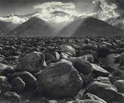


In these photographs, I can see black and white photographs of nature that capture a lot of space. For example, in the fourth image there's nature surrounding the space. It looks like a circle of the sky and ground and as if the wind has pushed everything upwards. I find this interesting because it uses space in a unique way by placing it all in the middle so the entire image is significant. If someone could not see these images I would describe it as completely natural as they all use places like mountains or lakes and the air which is interesting. The second image is captivating as it's a place not everyone can visit or see everyday and it almost looks angelic. The sunlight coming into the image is interesting as it's not disrupting the way we see the image but rather in the background so it's not dominating the image. I think the dark room was used in the fifth image as the land is dark compared to the lake and mountain so it almost looks like a positive. This affects the way we view it because we are drawn to the illuminating lake but we still notice the land before we look at the mountains. His photographs continuously use leading lines to highlight what he chooses the viewer to see. I am inspired by this because I want to use leading lines to compel my viewer into my photographs too. There are different tones of the black and white in these photos which separates these images from being very similar. However, if this was my work I would make it more effective by using colour in some images to show the contrast. This image would be similar to real life however, I think Ansel chose to make this black and white because in my opinion it wouldn't be able to capture exactly how it looks in real life so you look at the image in a different perspective this way. I would ask the artist how he chose the angle for each image as they are all different yet accurate in putting the images together as a whole. I would title these images as a 'breath of fresh air''. This is because it combines nature and the atmosphere to make an image with a good use of space. I think these photographs are supposed to tell a story all together. The last image is very different so could be the opening of the story as it shows you the first glance of what the bigger images are. If I was inside this photograph I think i would feel the sunlight and wind hitting me instantly. I would also realise how much bigger the space is but how Ansel interprets it to be smaller to fit her size image but still look like it has a variety of space. I think the photographer made these series of photographs because it explores how nature is very dominant but there is still an element of space perhaps to mirror human life of living. Nature is at one end of the photo and the other while space is in the middle showing a human life.
Nicholas Goodden response


In these images I can see a gloomy atmosphere and nature overpowering it. It seems like a usual everyday walk in nature and capturing the beauty of an everyday space that is normally passed and ignored. I have used shadows and darkness as an inspiration of my chosen artist's work as it creates a lonely and eerie atmosphere. If someone could not see these images, I would describe them as all having an element of nature within them, whether it is a shadow or trees. I find the last image interesting because it's from a different angle to how you would normally see it. It is like looking above while walking and admiring the beauty of nature. It also highlights how the street-lamps light up the night sky and streets.. I have used the element of lighting and angles to create these photos because I wanted to highlight how simple yet intriguing nature is to the viewer. When I further experiment with these images I want to use the dark room and perhaps studio lighting to create shadows and darkness which I am interested in. In the first image, I like how the streetlamp creates a circle of light and the lines from the light are pulled towards the camera as it looks interesting. In the last image, it is like the light is being uncovered from behind the trees and it is disrupting nature again. This series of photos was a play of light and nature and seeing how they combine. I chose to do this in the night because I was inspired by Nicholas's eerie work and used shadows too like his images. In the second image, space is used as I chose to only use half of the figure's shadow. This was because I wanted the viewer to also pay attention to the background. I t also uses leading lines, almost drawing you closer to the shadow. I would title these images as "a night walk" because it sounds so simple like a normal walk but it shows what is normally hidden and what we don't usually pay attention to. If I lived in this photograph I think there would be sadness yet darkness that perhaps the person inside the images has to fix by their mood. I think these images are effective because they all have a loss of light and create shadows which is what I am interested in. However, with the third image I want to continue developing it as I think it can become more interesting. Furthermore, one thing I think didn't go well was how the light was affecting the camera when it could've looked better if it was only illuminating on the trees. I am going to continue exploring different things I can do with these images to further create a sense of darkness and isolation.


In my first image I took an image of the school but I turned the exposure down to create a dark atmosphere. This adds a sense of isolation to the photo despite it having various objects in it. The lights in the distance add an eerie feeling to the viewer like if they were inside the photograph, they would be completely alone. In the second image, I can see a shadow except it's unusually bright instead of a black shadow which I find interesting because it also created an effect on the wall. This was created by the window in the third image which has lines along it, making things distorted when looking through. I took the third image as I like how everything is composed in the picture. For example, the flowers on the window which could symbolise hope as they are normally colourful but they have been shadowed by the darkness. Also, only the important parts of the image are focused and have light on them. In the last 2 images, I used a lower angle because I wanted it to feel overwhelming to the viewer as if the building could fall any minute and its closing in on them. This is to further highlight being alone. I carefully used leading lines in my work and the low angles to reel the viewer in and make them imagine the mood of being within the photograph. All of these images use different colours which was purposeful as I'm experimenting with what colours I think work best with my theme and my focus which is darkness and shadows to manipulate the mood of the viewer. I am most interested by the first three images because I think they work best with what I want to work on. However, I want to edit and experiment with the last two photographs to add more darkness.
Experiment 1


I turned my images into acetate and then used the dark room to make photograms. This is because I wanted to continue creating a dark atmosphere. The third image was in a meaningful place to me as I walk past this everyday so it's a place I have seen everyday growing up. I used a darker image which contrasted it and thread this through the photo because I wanted to take it further. I was interested in the first image because I used angles effectively. I created a positive and negative and these came out really well. I like this new theme and will continue exploring places that I see everyday.


I am still experimenting with my theme but at the moment I like the dark ambience and shadows because I think it incorporates isolation in places and spaces very well. I also liked using overbearing buildings or lines because it creates a sense of loneliness in a big space. The first 4 images are either taken in my house or school because they are places I visit everyday so I wanted to transform them into something I usually don't see them as. For example, in the second and third image I found lightness in the darkness and used them as the centre of attention. In the fourth image, I used leading lines to make the bridge seem overwhelming- like it will never stop. I chose to do this because the leading lines in the photograph make you realise how empty the image is and perhaps it's frightening that such a big space has no people in it. I used low exposure to make most of these images so in real life it would look different because there would be more darkness and the light would seem much smaller. I like the space I have used in the fifth image as one door is starting to open and the next one is fully open. The space in between enlarges every other object in this space which is interesting because it makes the viewer seem small.
Experimentation 2


In the second image, I used 3 images and turned them into black and white . I beginned by ripping them apart and then placing them together. Then, I tried to align the lines from each image so the image flowed naturally as one piece. Then, I photocopied the image so it can become one image and then I turned it into acetate. I put this in the dark room and created a photogram I am pleased with. I am going to continue exploring this further because I like how my photograms come out and I think this is a strength of mine.


I used photoshop to turn my image from earlier into something new. I used photoshop to invert my image and adjusted the brightness and contrast so the door was blue. I really like this because if focuses the image in one place. I then turned this into a positive and I want to explore this further when I make my final piece on making day.


I liked the composition in all of these images and the windows. They all seem overwhelming and never ending which I really liked.


I used photoshop to invert my image and then I used the history brush tool in the centre so this part of the image returned to it's original state and then I used the dodge tool to create a brighter area around this. I did this because there is a continuous circle in the image so it amplifies this. Also, it is an empty area so it seems ghostly. I have turned a crowded place people visit everyday into something other-worldly and I really like this how it is.

I developed my image from earlier of the building with various windows that looked overwhelming and printed out smaller versions of this. I edited all of the images on photoshop and inverted them so they could line up symmetrically. Then I used coloured pink acetate and coloured purple acetate of the same images and placed them on top of each other. This created a purple 3d futuristic look. However, you cannot tell this from a camera which is disappointing but I do really like this.
